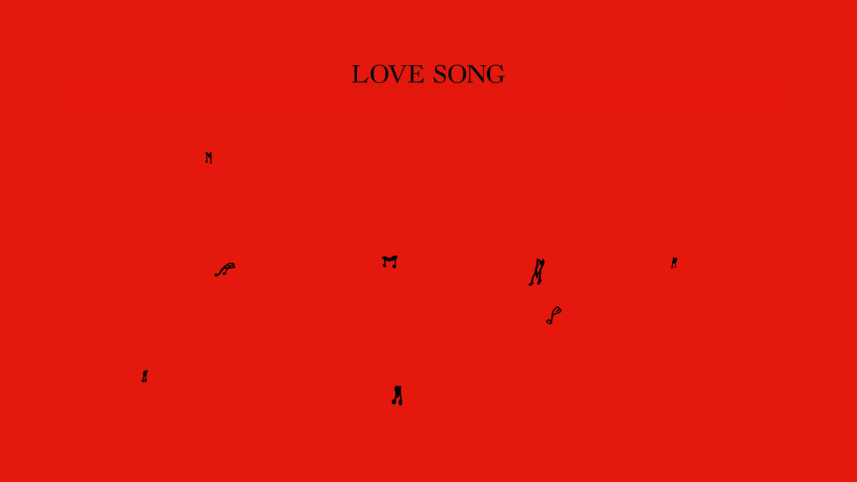
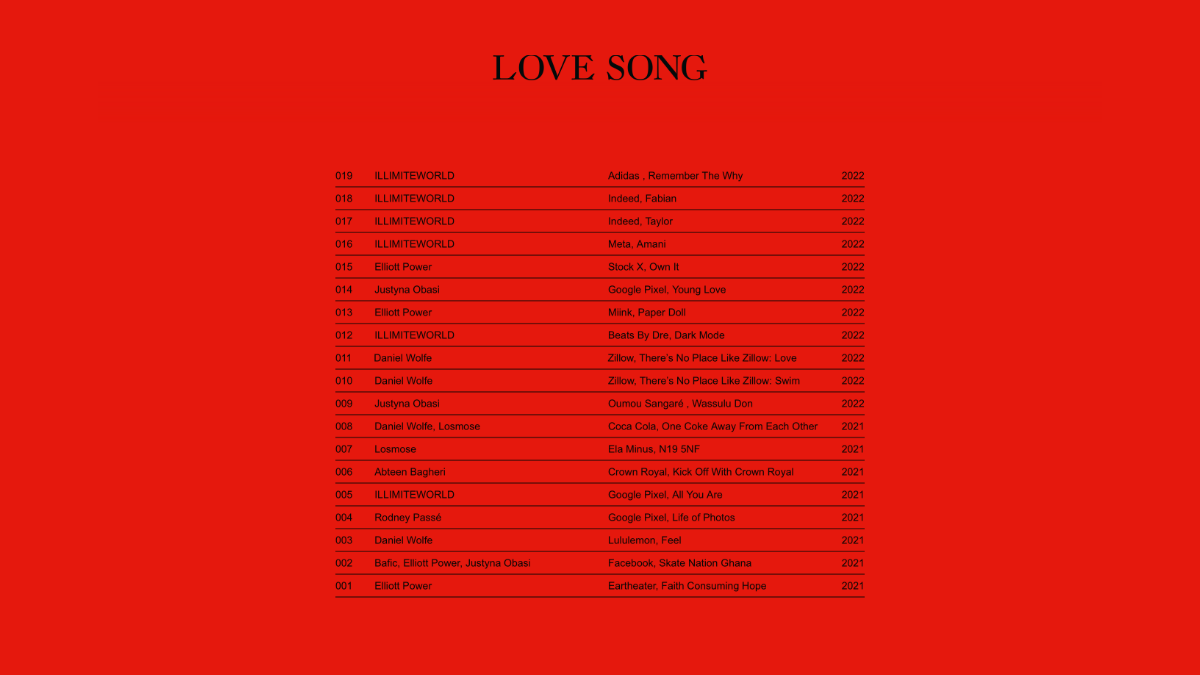
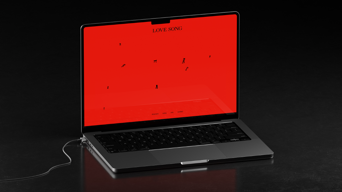
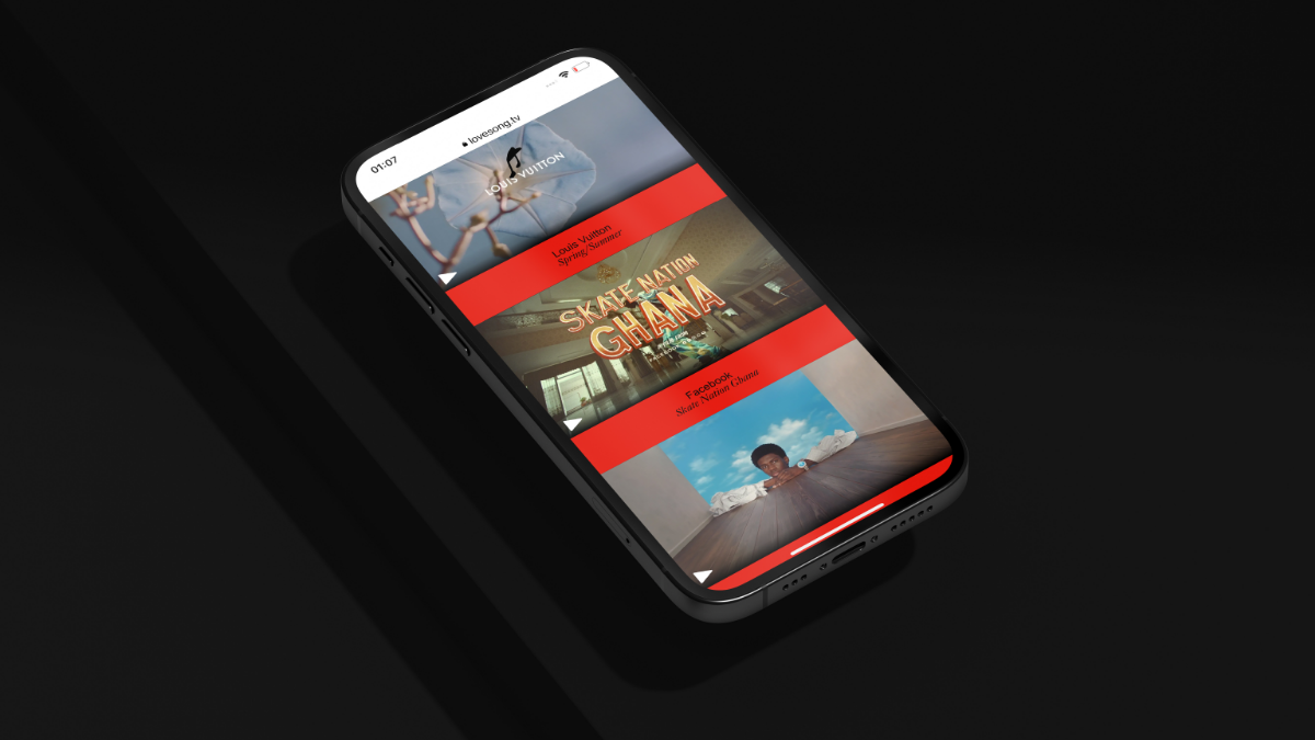
Love Song Website
We are always happy when we are recommended for work by one of our clients, and with Lovesong this was no exception. They were already working with Atelier Brenda and wanted our support to bring their brand vision to life through the website.
They wanted a modern, minimalist website which heavily focussed the viewers attention onto the work itself with few distractions. We worked with the designs from Atelier Brenda and our UX expertise, ensuring the designs ensured the designs were flexed to work on any platform, always with an aim to support the beautifully unorthodox approach to design and UI.
We used our learnings from working with other moving image-based companies to create a custom video player for Lovesong that reflected their brand personality without detracting from the content itself.
Call outs
We were able to apply a really agile approach to this work, to suit the busy schedule of our clients.

