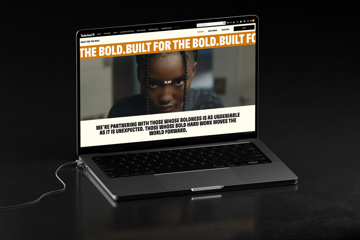
Timberland Built for the Bold
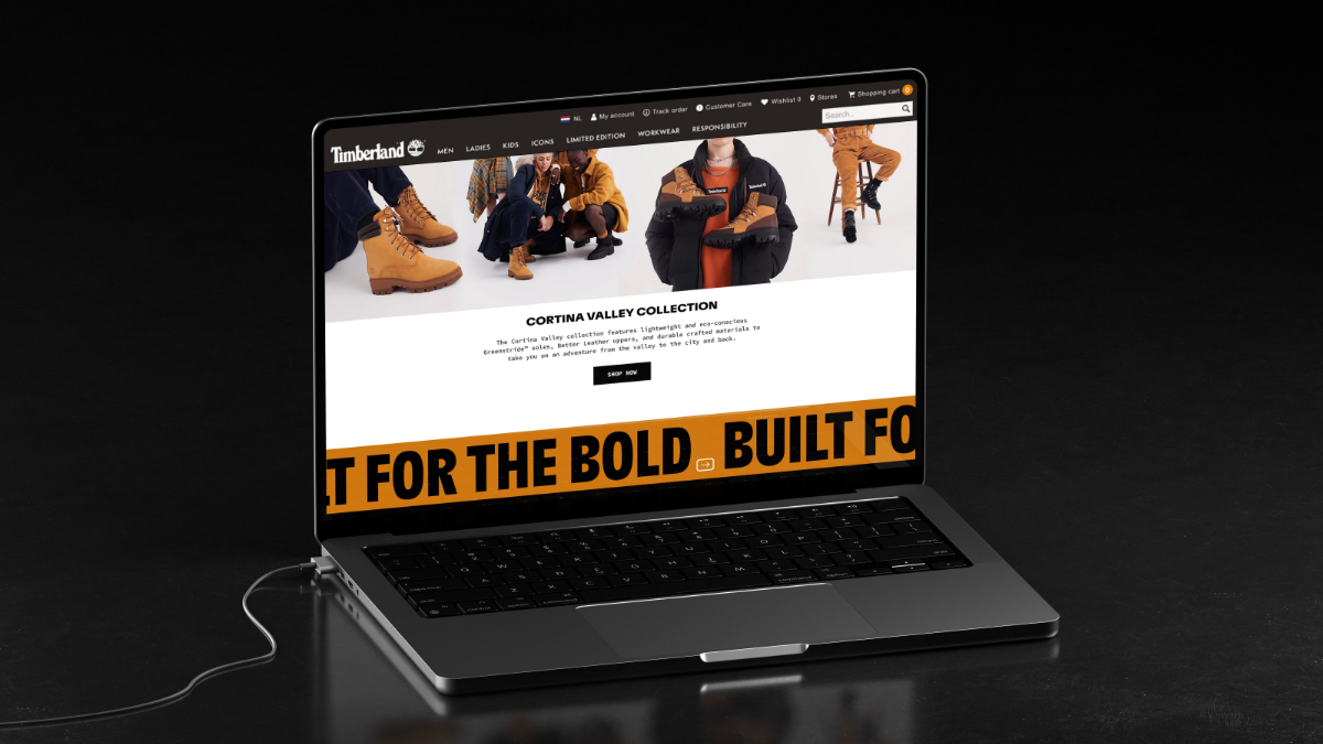
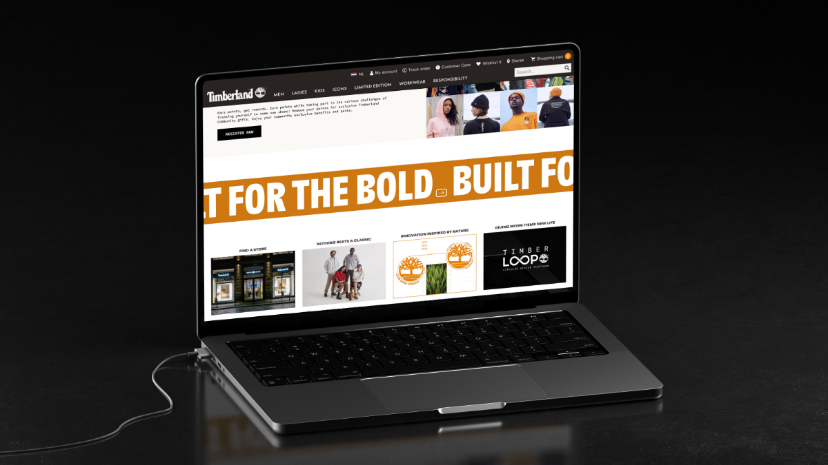
Timberland launched their new Built For The Bold campaign recently. Celebrating people whose bold hard work moves the world forward. Working with Rosie Lee Creative we developed the Visual Centre for physical retail. We were asked to take this physical visual centre and bring it to life on Timberland’s e-commerce platforms. One of the primary objectives of the work was to develop a seamless experience for their audience regardless of which parts of their journey were experience in-store or online. We worked closer than ever with Rosie Lee Creative on the concept to ensure a seamless implementation across all physical and digital touchpoints.
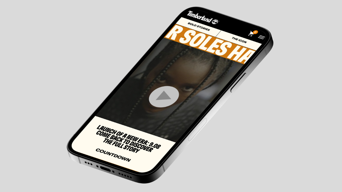
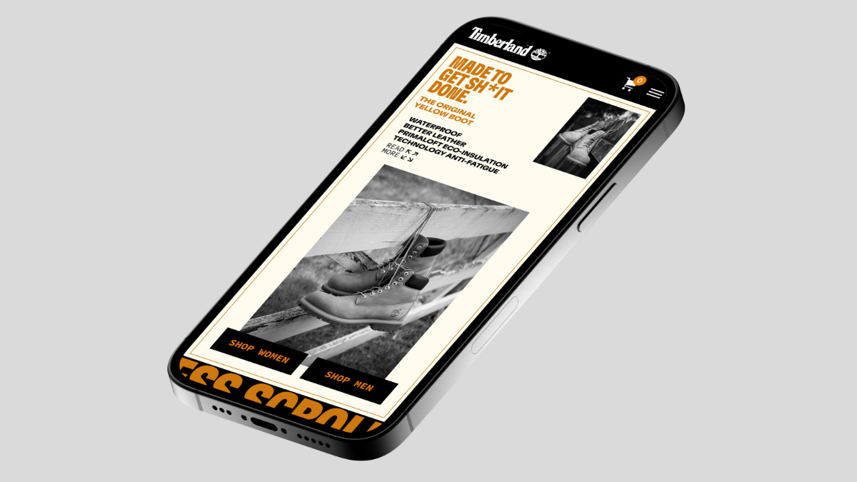
The second phase of Timberland 's Built For The Bold campaign was the key launch moment for the campaign where the team were introduced the Built For The Bold tagline and focussed on the launch video. With a campaign based on bold people, we needed to ensure the execution hit the site with its own bold presence.
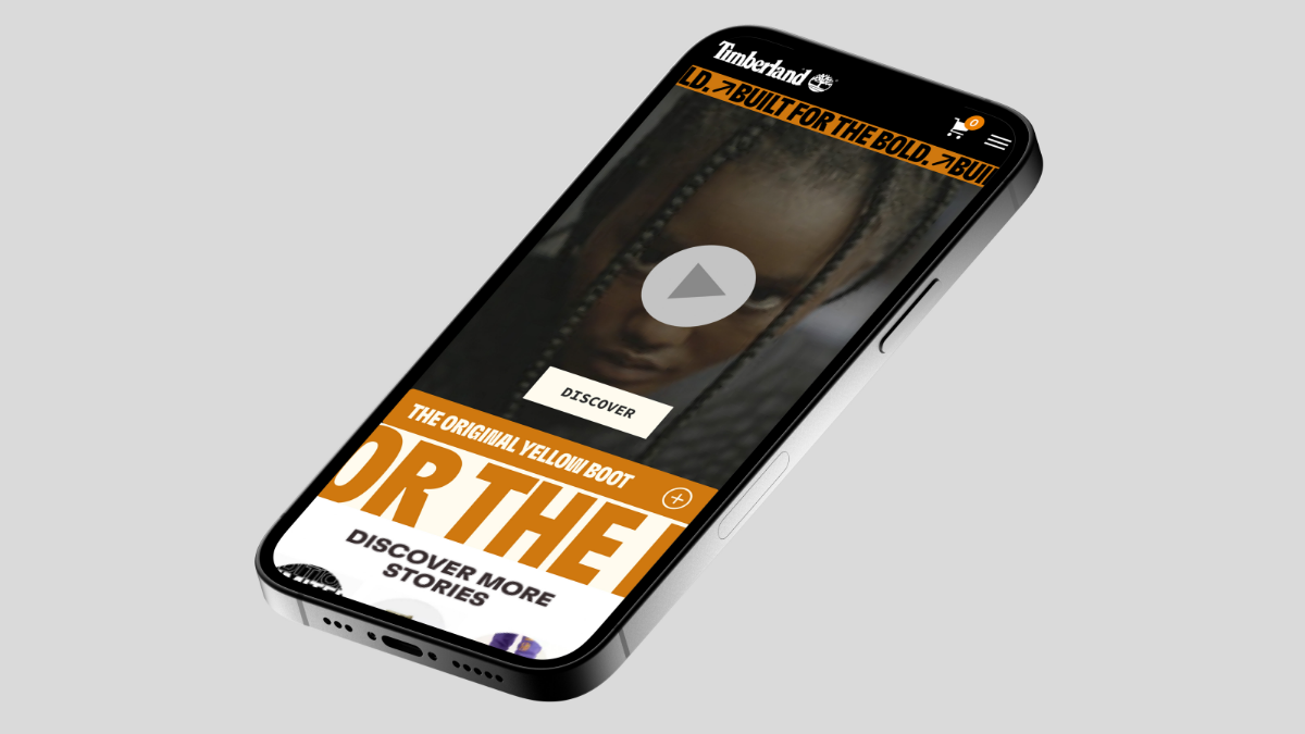
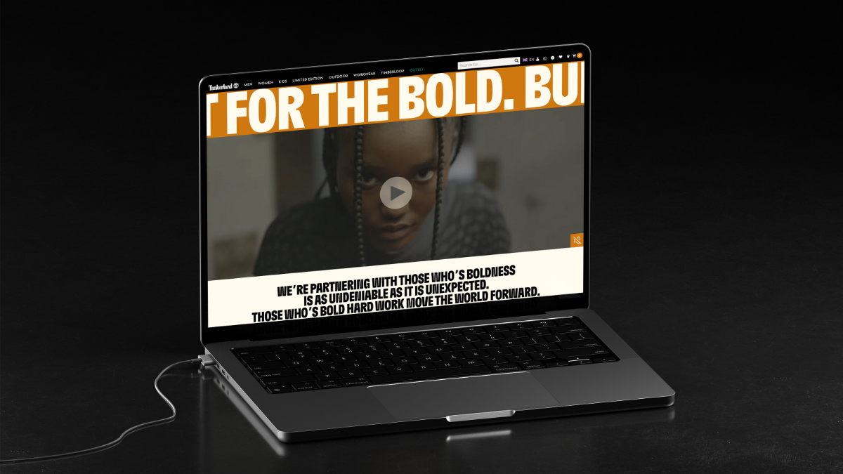
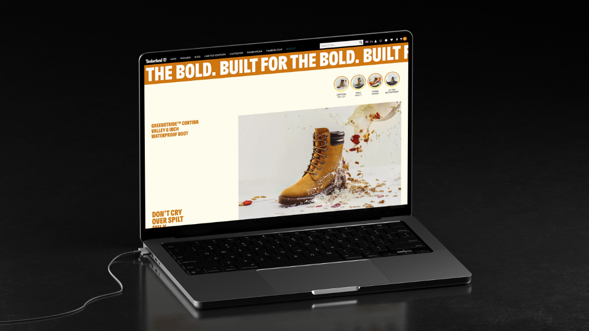
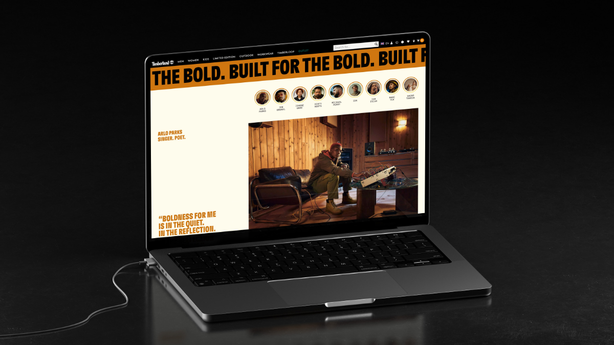
The final stages of our initial Built For The Bold digital launch focussed on deepening interactions and storytelling. New products were introduced, along with strong statements from Timberland ambassadors, explaining what being bold means to them. Each product has its own bold tagline, which was used to pull people towards more product information and eventually purchase.
Callouts
We were able to implement strategic and detailed requirements which led to holistic upgrades to the site.
By combining fresh brand strategy with modern UX experience, we created a unique, directional customer experience.
Navigating variety of complex priorities and stakeholders, culminating in a unified plan.
